Feb 24
2016
How Monolithic Medical Apps Hinder mHealth
Guest post by Khomushka Andrey, project coordinator, Sciencesoft.
Health professionals will hardly ever love documenting. By making tedious tasks easier and eliminating paperwork, medical apps spare time for doctors to focus on their patients more. However, physicians would rather use paper charts and sticky notes than try to figure out what goes wrong with the software.
The reason why mHealth for medical practices, clinics, hospitals and other care organizations might stay unused is that developers tend to build monolithic mobile copies of medical desktop solutions, trying to adapt the complex functionality to smaller screens. Off-the-shelf software vendors generally stick to this large-screen approach, as their goal is to cover the needs of as many customers as possible.
According to Healthcare IT News and the AMA (American Medical Association), however, physicians welcome a more customized approach. “Physicians have found that most EHRs lack usability and interoperability as necessary features for supporting high-quality patient care,” says James L. Madara, MD, CEO of the AMA.
So thinks the AAPS (Association of American Physicians and Surgeons), which represents the end users of such apps. Executive director Jane M. Orient, MD, states that “The costly, clunky systems the government demands are worsening the problems and even driving some software experts back to paper.” And just to emphasize it, according to Healthcare IT News, 80 percent out of 571 physicians surveyed feel that EHRs impede patient care and almost half claim that patient safety is at risk.
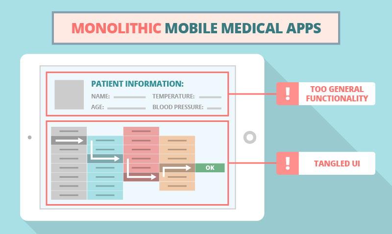
Now, if the desktop solution clogs effective care, then its smaller copy will be even more clogging. And there are two main reasons of that:
- Too General Functionality
As the copy of a large-screen EHR/EMR, a mobile software can’t provide all health specialists with equally useful toolkits. Imagine a primary care physician and an admission department employee using a single app with a list of trivial tables including patient information such as name, age, temperature, blood pressure and some other SOAP notes.
Neither will an ophthalmologist or a cardiologist find these general features sufficient for proper examination and treatment. Depending on the area of expertise, each specialist needs particular functionality, such as the list of procedures and/or surgeries related to diagnosis, stress test information, eye retina check data, heart ultrasound images, MRI results, biopsy results and more.
If health professionals can hardly access this specific information because of a mazy navigation, the app will only serve as a reminder card to refresh the basic patient data in mind. If the software can store images and last visit records but does not allow a fast document overview, the doctors will have to open every file to understand the patient’s condition better.
Such systems provide no ways to optimize the treatment process.

- Tangled UI
Creating an interface, both straightforward and sufficient, is challenging. The art of mobile app development lies in selecting the needed functionality that would be handy for each particular department and employee. If, for ultimate guidance, developers refer to the desktop EHR/EMR application only, they will inevitably push mobile users to go through numerous screens, thus impeding the organization’s workflow.
Heavy apps increase the risk of medical errors and prevent the real-time updating of information about patients’ current and SOAP health data, procedures, tests, checks and more. Let’s examine the two biggest medical mobile app UI troubles:
- Confusing navigation. At first, specialists might naturally spend some time on browsing through the app and trying to find a specific button, field or list. And that’s okay, but adapting to a new software shouldn’t be exhausting. Bad navigation eats mental energy like a small stone in a shoe that won’t get any better after having walked a few miles.
- Invisible errors. When it comes to user errors caused by a wrong UX, if the interface fails to provide an adequate feedback with an error message, the physicians might not even realize that they’ve made a mistake. With medical errors in particular, a mobile app should notify users about probable mistakes (e.g., medicine prescription problems), asking doctors to confirm or cancel the operation via a push notification or message box.
Unhandy systems might even force care specialists to get back to paper-based workarounds. And that’s the most obvious evidence of a complete UI failure.
Avoiding the Monolith
The mobile approach avoids huge monoliths. Developers start a project from scratch, forgetting about the multidimensional desktop EHR/EMR pattern. They create small and convenient apps to perform particular tasks.
As this approach brings few major benefits to caregivers and health specialists, we elaborate on this topic in our fresh blog post. You are welcome to follow the link and let us know what you think in the comments.
This is a sponsored post.
Thanks for sharing your experiences, Andrey! Very helpful.